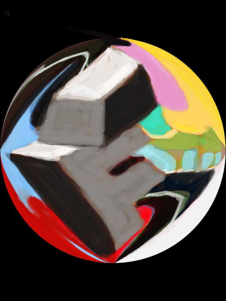
Impossibly Fantastic. Intriguingly Flippant. Irresistibly Flamboyant. When I get this inked on my shoulder, with all the possibilities, no one will ever guess it actually stands for Internet Fiend.
Thanks for visiting. I like especially your Song 2. Though I had to turn the speakers up very loud and take the tin foil off of my head to hear it.


13 comments:
Nice. Although, I would hate to see what this tattoo would look like after thirty years or so.
love
this is so amazing! it has a lot of dimension and a unique perspective capped off by great colour!!!
hihi! "IF" what better way to place a tatto for IF... ^_^ {{huggss}}
Your style is Really growing on me. So cool.
This made me think we should all get IF tattoos. What do you think? An IF tat for all right on our butts.
This stuff looks great. As I am very sparse with my colors since I favor a crisp pen and ink style. Definitely digging the use of bold colors.
I was looking through your site, I very much enjoy your style, cool illustration friday tattoo!
great piece I love it
Love the design of this piece!! :)
Makes me think of the Enron logo. Gosh, I need a life! Great piece.
Impossibly Fantastic. Intriguingly Flippant. Irresistibly Flamboyant.
When I get this inked on my shoulder, with all the possibilities, no one will ever guess it actually stands for Internet Fiend.
Thanks for visiting. I like especially your Song 2. Though I had to turn the speakers up very loud and take the tin foil off of my head to hear it.
Beautiful brushwork and color contrasts, as usual.
Hmm, I foresee a day when we all have this branded onto us!
Post a Comment